- Tuesday 28 July 2015 - Tolkien Calendar 2016: Illustrated by Tove Jansson
- Monday 27 July 2015 - The Amateur Lord of the Rings
- Friday 17 July 2015 - J.R.R. Tolkien a writer of note
- Friday 17 July 2015 - Why tolkien's books are so popular Among the Students
- Thursday 16 July 2015 - The world first publication of a previously unknown work by J.R.R. Tolkien,The Story of Kullervo
- Thursday 11 June 2015 - Rare The History of Middle Earth, all 3 Limited Deluxe Editions in Publishers Slipcase
- Saturday 6 June 2015 - Signed copy of the Hobbit sells for record at auction
- Sunday 3 May 2015 - On the shores of the shoreless sea
- Sunday 19 January 2015 - New Collector Profile added - Giulio Torlai
- Saturday 29 November 2014 - Back to the past - Simon J. Cook on Tolkien and History
- Tuesday 7 October 2014 - Will we ever see The Silmarillion on the big screen?
- SHOW ALL ARTICLES
 Subscribe in a reader
The 2012 Tolkien Calendar by Cor Blok - a review (05.03.12 by Ruth Lacon) -
Comments
I have not reproduced all images here, since I believe the images are best enjoyed by having the calendar up your wall! I do have some signed copies of the 2012 Tolkien Calendar left, as do I have some signed copies of A Tolkien Tapestry - Pictures to accompany The Lord of the Rings. If interested do contact me.
More info on this book which features all of Cor Blok's art can be found here.
At the moment there is also some original art by Cor Blok available. Don't hesitate to enquire and make an offer!
About Ruth Lacon
The review below is written by Ruth Lacon, a skilled illustrator and calligrapher, highly influenced by early Persian manuscripts. Her work can be seen in The Ruins of Osgiliath, the Nigglins, Amon Hen, Mallorn and in books like for example "The Uncharted Realms of Tolkien". The Tale of Gondolin would not have existed as we know it know if Ruth Lancon from Edinburgh had not been inspired by The Fall of Gondolin Song Cycle. In 1993 Ruth Lancon send 17 fine illustrations to Alex Lewis together with the suggestion of publishing The Tale of Gondolin for members of the Tolkien Society. All the rest is history now...
Review of the 2012 Tolkien Calendar
This is the second Tolkien calendar by this artist, and I’ve already said a good deal about his style and the problems which it may cause for some viewers as well as its potential to enlarge understanding among both modern-art lovers and Tolkien fans. I’d urge anyone who missed last year’s reviews to look them up, as I’m not planning to go over the same ground again.
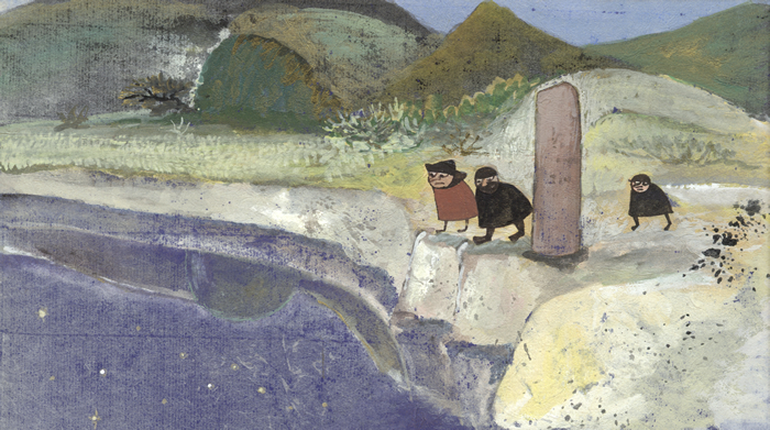
In many ways this is an atmospheric and evocative work, using softly shaded yet subtly dissonant colours to suggest something askew in this landscape. Its balanced ‘spot’ composition is an unusual achievement for a modern Western artist, but perhaps not so surprising in someone who admires Mondrian as well as mediaeval art.
However, sloppy paintwork mars some areas, the hills especially, where marks which can be read as snow are neither overtly descriptive in the mode of the rest of the image, nor possessed of enough calligraphic strength to work as abstracts. Overall, to a British eye this piece is distinctly Lowry-esque – and in the associations of that style with industrial wasteland, none the worse for the suggestions that brings.
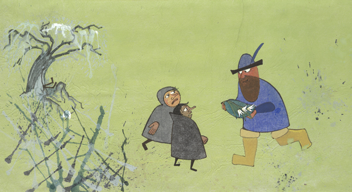
February: The Company Attacked by Wolves.
An awkward cross between post-Renaissance and mediaevalist-flat perspectives will make this hard to ‘read’ for many viewers, the suggestions of space conflicting and producing unintended effects. The wolves are not emphatic enough to carry the composition as they appear intended to, but I do wonder if this may be due to change of pigments with age over the dark ground – far more experienced artists than Cor Blok was when he painted this have been undone by that problem. For myself I feel that the dark ground needed stronger crosslighting in reproduction to bring out subtleties now apparent only on very close examination in good light. On the positive side, this piece shows what Cor Blok can do in handling paint, as all its brush-drawing is applied with strength and verve. In potential, and perhaps at first in fact, this piece can be compared with the near-monochrome ‘night scenes’ of Early Renaissance artists from the Low Countries such as the brothers Limbourg, of the Trés Riche Heures du Duc de Berry.
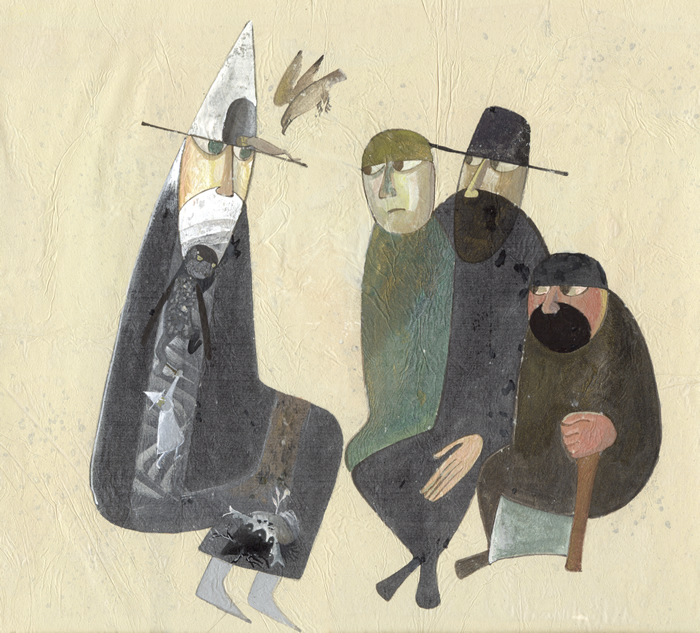
It takes time and a close look to understand the innovative elements of this picture. Like a historiated initial in a mediaeval book, Gandalf becomes his own adventures, the outline of the figure containing several episodes of the story he retells to Aragorn, Legolas and Gimli. Narrative is expressed without theatricality, story unfolds within one scene with minimal repetition of figures – it’s beautifully done. This is combined with taut placing of all the figures on Blok’s usual delicately shaded ‘emotive cloud’ ground to create a strong overall composition. Cor Blok’s work often defies his own ideas about the necessity of pictorial art making its point to a single glance, and this is definitely a case in point. Simple as this picture seems, it richly repays close and thoughtful examination, reading as well as looking. It’s one of my favourites in this calendar.
From the sublime to the ridiculous... The single-colour background has perhaps just not reproduced well, but as it appears here it completely lacks the enjoyable subtleties which Blok’s complex technique can lend to an image, relieving expanses of plain colour without distracting the eye. This just looks flat. Space is neither mapped nor represented.
The composition, if there is one, is just woeful, artistically limp and narratively barely sufficient. I suspect that many viewers will find this lacks all emotional tension, since what the figurework lacks is conspicuously not made up for by the other elements. The problems are compounded by sheer sloppiness in the paintwork. Old Man Willow is bad enough, and is pushed into the ‘background’ by something which I would guess is supposed to be riverside vegetation, but ends up as pure scrawl with neither descriptive nor abstract force.
I’ve talked about this before, and it may be worth taking this chance to explain a little. Talking about something so visual is difficult, so I’ll try to suggest examples you can follow up. Brushwork can be descriptive without being realist; that was the key insight of the Impressionists. Look carefully and closely (in the original if you possibly can, at original size if not) at a work by Morisot or, more familiarly, Monet, and you’ll see what I mean. Gestural brushwork of this sort was one of the post-Second-World-War discoveries which took abstract art in new directions with the likes of De Kooning and Franz Kline. These Abstract Expressionists used the mark, the brushstroke, for its abstract value first, its descriptive worth second if at all. They also drew on the rich resources of East Asian art, which in China and its neighbours had long since elevated calligraphic brushwork to levels which the West barely imagines. This area also has a long history of maintaining minimal descriptiveness alongside the compositional and painterly virtues which we associate with abstract art. Try looking up Hsia Kuei and Yü-chien’s versions of the same subject, Mountain Market in Clearing Mist (and check their dates for a real surprise...). David Hockney's latest work, about to go on show at the Royal Academy In London, provides an excellent modern example. Brushmarks expressing snow on hill, as in January of this year’s calendar, could very well be descriptive in the way the Impressionists pioneered, or decoratively strong in the manner of Japanese artists such as Ogata Korin, or as abstractly forceful as Yü-chien’s. If none of the above apply, if instead there are weak, wandering lines (often prone to creating Rorschach-blot unintentional extra imagery), that’s what I call sloppy paintwork.
Overall, this is one of the ones I like least. It looks as if it has been dashed off without sufficient thought or care, and ends up merely clumsy.
This is an unusual scene, one whose possibilities are well brought out by this fine picture. It successfully balances decorative splendour, painterly verve and narrative communication. I’d like to know how the original scale of this piece compares to that of others in this calendar – it feels markedly larger, in concept as much as execution. There are definite echoes of the late-19th-century artist Gustav Klimt, but his overdone Byzantinism has here been hauled under control by an eye trained on the landscapes of the Northern Renaissance, to markedly good effect. This is one of my favourite pictures in this calendar.
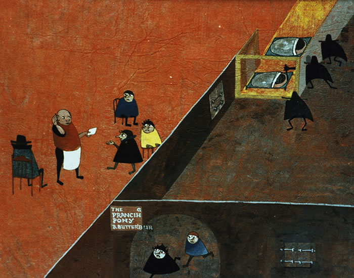
Startling to a first glance, the roofless isometric projection employed in this image is in fact a classic Japanese illustrative technique, going all the way back to early 12th century Heian-era narrative handscrolls. Here, it’s used with a sure hand to create ‘space cells’ within which several sequential events happen simultaneously. The composition is good, the narrative aspect is well-handled, and the rich colourings are well-chosen to reinforce divisions in space, time and emotion. I suspect that this picture will deeply confuse many viewers, which is a pity. Live with this one, let it explain itself, and I do think that you will come to appreciate it.
Middle Page: A Tolkien Tapestry.
This montage brings together small versions of many of Cor Blok’s paintings inspired by The Lord of the Rings. As a single image, they blend into an awesome near-abstract mass, a flickering geometric colour-array which begs comparison with Mondrian’s transitional works, hovering between the naturalism of his early years and the pure abstraction of his best-known later paintings. The text is in some ways useful, reminding us that all these paintings are the result of a staggering outburst of creativity over a very short period of time. However some of its assertations are less certain than it makes out. As a matter of fact, I know of at least one other ‘multiple work’ on this scale inspired by J.R.R. Tolkien’s writings, Paul Gregory’s polyptych containing 61 individual images, one for each chapter of The Lord of the Rings. It’s also risky to say that many of the scenes chosen are unique representations. It would take very close and careful research to prove such a point. The limitations of publication have meant that even work by professional artists is not always widely known. As, indeed, the fate of Cor Blok’s own work, only coming to light now some fifty years after its making, shows us.
The idea of abstracted trees is a good one, but I am unsure about the execution here. Also, why is Treebeard in the classic one-leg-straight, one-knee-bent, arms-at-head pose of a reclining Venus (as seen in everybody from Titian’s Venus of Urbino to Manet’s Olympia and beyond)? It’s a ludicrous visual ‘quote’, wildly out of place and character. The dark background is atmospherically effective, but as elsewhere, I’m starting to have worries about its effect on overlying paint after even this relatively short length of time. We may come to be very glad that these works were properly recorded now. Overall this is an awkward piece, hard to judge.
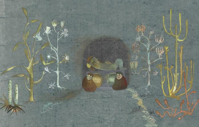
I really like this one. It’s a delicately atmospheric work, quiet and reflective in more than its imagery, realised with near-abstract means which are nonetheless precisely expressive. The figures do exactly what is needed, no more and no less, carrying the narrative and adding to rather than detracting from the formal and emotional qualities of the painting. It’s one of my favourites in this calendar.
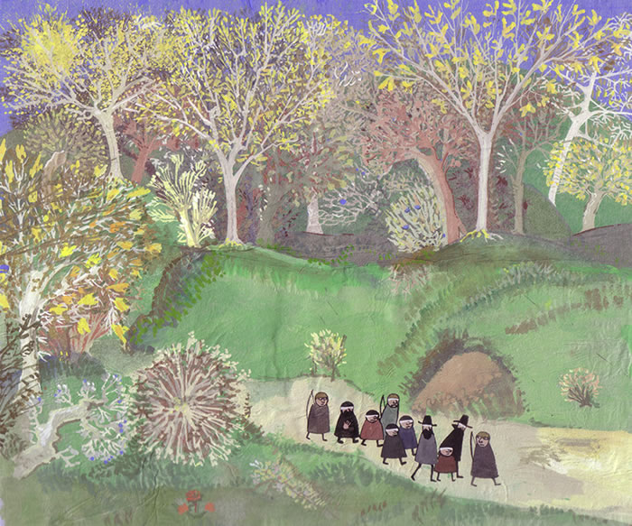
September: The Encampment at Dunharrow.
The idea and the form are interesting, making good use of a classic Chinese landscape format to convey a deeply awkward narrative which Western perspective finds hard to handle. The balance between realist and flat perspectives is well-handled. However, the picture is badly let down by the critical midsection of rockface, which is lamentably lacking in strength and expression. It’s hard to be sure of the cause of the awkward cropping at the top – it could just be a publishing mistake. As things stand, the result is to make a critical area look weak and unfinished. The lines of the mountain lack the force required to suggest continuation beyond the edge of the image, and the surrounding ‘distant hills’ are cramped and airless. For me, this comes very close to being a really good painting, but it falls awkwardly short.
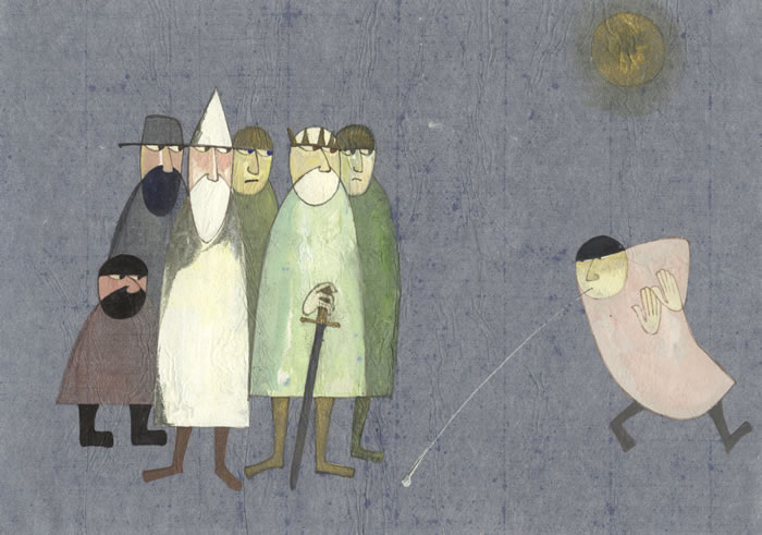
I’m sure this is not supposed to be funny, but to British eyes it has distinct comic verve. Gandalf, Théoden and company are the boot-faced ‘straight men’ while the almost dancing figure of Grima spits with a remarkable exaggerated force. This is another piece where I have to wonder if the image is already suffering with time; the ‘sun’ at top right lacks all compositional force as it stands, but the presence of brighter pigment atop the ‘wrinkles’ suggests deterioration.
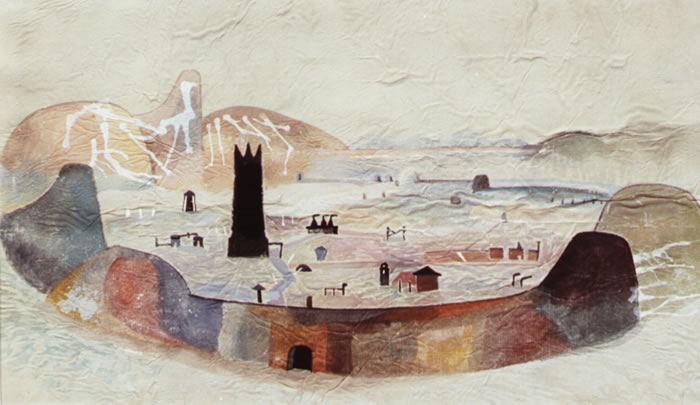
November: the Watchers.
The dark, sombre atmospherics of this picture are so exaggerated as to make it hard to read – is that Sam climbing over a rock at the bottom, or not? It also seems to suffer from reproduction below size, with detail in areas such as the Watchers themselves being lost to all but close examination. Also, like November: The Forbidden Pool in last year’s calendar, it is very much ‘of its time’, in a style not easily evaluated now. It’s very easily read as a ‘Cold War’ piece, with its Kremlin-like blank red wall, dark, dank atmosphere and grim no-frills architecture. I can’t say I particularly like this one, though I have to admit that may change on longer acquaintance. This is in many ways a well-composed, well-painted and evocative piece which deserves the fairer judgment that only time can bring.
The startling ‘game of two halves’ compartmented composition of this painting allows dramatic use of simultaneous narrative. I happen to really like it, but it’s going to confuse an awful lot of viewers. This is for me a highly ambitious painting let down by woefully sloppy paintwork.
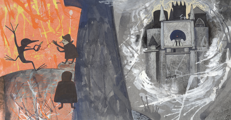
Uncontrolled marks scrawled onto the paper have no abstract expressive force of their own and too frequently create unintended humorous images either in their own positive line, or in the negative spaces they contain. (For example, in the lower left of the right-hand ‘outside’ compartment, the shadowy form of that great Scots bogey-beast the Wild Hairy Haggis looms over the shoulder of Mount Doom, complete with bag-pipes...) Sam is reduced beyond even Cor Blok’s norm to an R2-D2-like expressionless blob, while Gollum’s victory capers make him look as if he’s been connected to the electrical mains circuit. If this came with ‘Sketch’ – or even, dare I say it, ‘Impression’ – prefixed to its title, I would cheerfully allow it considerable value as an inspired shorthand essay. It certainly suggests what could be done in this style, with this subject. But as this stands, for me it’s a valiant failure.
Review of the Introductory Essay
In the Introductory Essay to this calendar, Cor Blok restates several points about JRR Tolkien’s opinion of illustration and the nature of his own art which were made before, a necessary concession to this being a ‘second instalment’. I’m not going to look at this in detail here, as I have recently written a long essay on JRR Tolkien’s attitudes to illustration, their sources and their changes over time, as well as their potential implications for us today.
It was more than a little interesting to see many of my points - not least the value of artistic 'applicability' and the importance of reclaiming unfashionable genres - backed up by no less a figure than David Hockney himself, one of Britain's greatest living artists, in an interview about his latest work, featured in the magazine The Radio Times of 7-13 January.
One point though is I think worth picking up here.
Whoever was behind Cor Blok’s comment that ‘My pictures to accompany the saga of the Ring, at least, are not intended as sources of information about ‘what things looked like (or might have looked like) in reality’, in the sense that one goes to ancient Egyptian paintings to find out what ancient Egyptians looked like...’, was seriously wrong in thinking that such a ‘reality’ can be shown for The Lord of the Rings at all. JRR Tolkien himself made that impossible, by his fiction of the book as a translation, whose origin is a ‘found manuscript’. This creates a situation wherein we are told that the real names of people and places are often not used, and that other names have been substituted. These occupy the same relation to each other that the real ones do, and their connotations are expected to be recognisable to the reader as the originals would not be. So the ‘imagined reality’ which Cor Blok speaks of is already removed within the text, replaced by verbal imagery which the ‘translator’ expects us to understand and appreciate – verbal ‘illustration’, in effect.
This is a strange idea indeed, a narrative strategy at odds with any simple understanding of The Lord of the Rings as either medieval romance or modern novel, or as a hybrid of the two. The critic might complain that it’s an afterthought – but it’s an afterthought by the author. It’s a deliberate move to affect our understanding of the text now, regardless of (indeed radically separating it from) the process by which it was created. It was present from the beginning of the book’s public existence in the very different First Edition Foreword, and it was expanded in the complexities of the Second Edition Foreword and Prologue. It’s true that even a commentator as insightful and sympathetic as Tom Shippey has not always understood this strategy. If however you engage with the book, if you suspend disbelief and play along creatively for a while, then the facts and their implication become obvious.
This idea of ‘translation’ immediately interposes a veil between us and any supposed ‘underlying reality’ of the text. Our author tells us that we don’t have the original, only a translation, and one which substitutes material that we are expected to understand and respond to, in place of the unfamiliar, alien and unreadable. ‘Reality’ here, in fact, is a concept as dangerously slippery as the fish in the guarded pool of Henneth Annun. All the artist can ever do is to create a set of visual equivalences to that verbal translation. Begging Cor Blok’s pardon for stating the obvious, style is the least important part of that process. What to my mind does count is the ability of the artist to create a clear, consistent and readable set of visual ‘symbols’, whether virtually photorealistic or ideographically abstract, that sit alongside the text and remind the viewer of that background pattern of relations and differences, just as the author’s ‘fiction of translation’ does verbally. This is often information that is given once and not again, easily forgotten through the span of reading a long and complex tale. For instance, by the time we actually arrive in Gondor in The Return of the King, most readers are not even physically in the same volume as the description of Boromir, back at the Council of Elrond in The Fellowship of the Ring. It is also information that a reader may not pick up on, if they don’t have the background which JRR Tolkien expected us to share. The artist/illustrator can usefully restate it in the very different mode of visual communication, to help readers take in an event in its full complexity – the classic ‘complementary information-provision’ function of visual imagery alongside verbal text.
I would go so far as to say that it doesn’t even really matter which set of visual translations we use, as long as they signal consistently the connections and differences that are an important part of the story. On the one hand, a narrow view of ‘truth to the author’ might suggest we ‘should’ keep to Tolkien’s set of ‘translations’ – the familiar pattern of c.18th century hobbits, 5th/6th century Germanic Rohirrim, and 5th/6th century Late Antique Mediterranean for Gondor. On the other hand, practically nothing in the verbal descriptions within LotR actually gives us any idea of style. We recreate things according to our ability and knowledge (or lack thereof). As readers and especially as re-readers, we are continually applying imagery derived from our wider understanding of this book, to the story within it. Since we are ‘translating’ anyway, as soon as we step outside the references the author uses, any visual code that maintains the necessary set of connections and differences will do. We need not stick to Western history and art as a source; we need not even keep to any historically inspired style at all.
There is a long and honourable tradition in art of using ‘conventional’ figuration to represent persons and events. There’s no reason why we should not do the same in creating art inspired by JRR Tolkien’s works, whether intended for the wall or the book, and there might be very good reasons to do so. Pauline Baynes’ figures in her illustrations of JRR Tolkien’s books wear ‘medieval’ dress with no thought of accuracy of period, but a good deal of specificity to character. We do not get the information to say ‘this is how it must have been’; we do get enough information to recognise what is happening and who is involved – a whole different matter. Cor Blok himself did this, usually with considerable success. It need not though be restricted to such a style. Even remarkably ‘realist’ figures can be conventionalised in this way, their overriding ‘unreality’ signalled by costume which is recognised as of no time or place. It’s true that we in the 21st century are thoroughly out of practice at painting and viewing such images, but it might well be something we could usefully reclaim from the past. No doubt any art-historically minded reader will gasp if I mention Cor Blok’s Journey through Lorien and Claude Lorraine’s mythographies in the same breath – but they are actually doing the same job with the same means. Why not pick that idea up and run with it, rather than getting bogged down in a fruitless debate over ‘reality’ and realism?
So, overall, what do I think?
This calendar reinforces powerfully the point which I made last year – that Cor Blok’s art is a standing rebuke to anyone who thinks that narrative and modern art don’t go, or that ‘fantasy art’ is made up only of virulent sub-Hollywood realism. This is about as different as it gets, for both sides – and therefore, no doubt, it’ll be driving a lot of people crazy. But I’d like to suggest you try very hard indeed to swallow your doubts, live with this calendar, and let it talk to you over the year. Weird as this art may well seem, at its best it has evocativeness, visual power and narrative strength. When it fails, it does so challengingly; the worst pieces still drive us to imagine what might be. These paintings are, more clearly than ever, the work of a young artist in the throes of a truly remarkable outburst of creativity. If Cor Blok’s reach sometimes exceeded his ability, well, that’s how we learn. I can fully understand him not wanting to revisit this material, but nevertheless I do think that it’s a great pity that in all likelihood, we’ll never see what a mature Cor Blok could make of some of the many ideas he touched on in this body of work. The potential for development is obvious, and the results could be awesomely good.
To finish, let me quote myself, for I feel that this judgment still stands: ‘This calendar is... likely to be as widely misread as admired. It is also by far the most challenging, interesting, and indeed inspiring calendar we’ve had for a long time.’ It is well worth having for itself, as a fine group of images from a strikingly unusual body of work. And I really do hope that Cor Blok’s work will not stand alone for long. If this and the previous calendar start a new trend towards innovation in style and approach, in art inspired by JRR Tolkien’s works, we will all be the winners.
Ruth Lacon, B.A., B.Sc.
Tolkien Calendar 2012
Publisher: HarperCollins
Publication Date: 1 July 2011
Type: Calendar, 32 pages
ISBN-10: 000742809X
ISBN-13: 978-0007428090
Publisher: Harper Paperbacks
Publication Date: 16 Aug 2011
Type: Calendar, 32 pages
ISBN-10: 006208920X
ISBN-13: 978-0062089205
Spread the news about this J.R.R. Tolkien article: