Image and Glance - Some Thoughts on tolkien-inspired Art and Illustration (31.07.11 by Ruth Lacon) - Comments
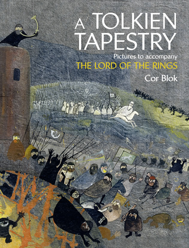
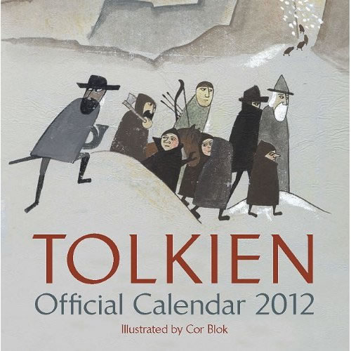
In the mean time the new Tolkien calendar by Cor Blok is ready available and the book about his complete collection of Lord of the Rings works is one month away of being released.
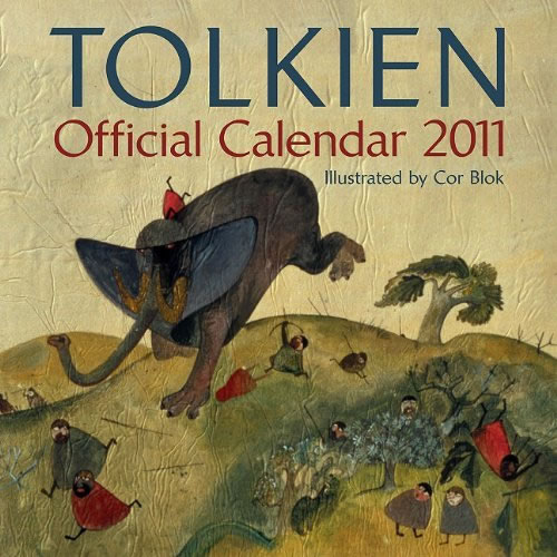
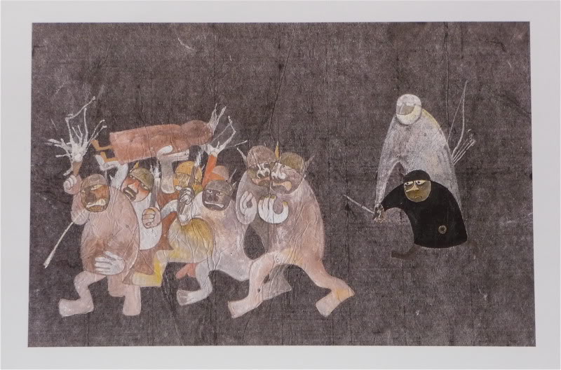
Still, Cor Blok's art did throw up a lot of dust when the Tolkien calendar of 2011 came out, and it was a long time since I saw discussions about Tolkien related art getting so heated.
Some liked it, some disliked it and there did not seem to be a middle road. I was happy to receive the following essay that gives some kind of expert review of the 2011 calendar and will probably re-open the discussion.
Putting unabashed ‘fine art’ into a calendar, as in this and next year’s Tolkien Calendar by Cor Blok, creates an interesting situation. For a hundred-odd years the mainstay of ‘Modernist’ ideas about how people look at art has centred on the stroller in the gallery or museum; the person for whom a picture really does have to make all its impact at a single glance, just as Cor Blok says in his introductory essay. They might condescend to look for a little longer, but they soon move on. In attending to the single glance of the stroller, though, Modernist aesthetics has lost sight of people who live with art. Visiting galleries and museums is a special event for even the most dedicated, but all of us have homes and wall space. We can and do buy things to hang on those walls, an original, or a print – or a fine-art calendar. That creates an entirely different situation, and it’s why I’ve said the current calendar is going to be so interesting.
Living with a picture is a very different experience to visiting it. To keep a painting or print at home, it has to hold your interest over a long period. It has to have the ability to become familiar – and then to surprise you all over again. Speaking as an artist myself, I’ve noticed at exhibitions that what people buy is rarely what takes their eye first. Instead, it’s the piece they come back to again and again. It may even be something they thought they didn’t like when they first saw it, but – rather like meeting people at a party – the chance to get to know it changed their minds. Once you have a picture at home, you can take your time about looking at it. Maybe most of the time you don’t really pay attention, but every so often it will catch your eye. You might revisit it only for a hasty glance, when you saw it in a fall of light that had never been there before – a different time of day, a reflection, weather. Or you might find yourself looking, contemplating, thinking. Sooner or later, too, you’ll have to move it, if only to repaint the wall. That too reopens the conversation between you and the work, as you see it in different settings. Even prints of paintings long since worn down from avant-garde freshness into chocolate-box convention can sometimes strike the viewer afresh, seen from an odd angle or in a different light. It’s the renewal of vision that J. R.R. Tolkien himself talks about in his essay On fairy-stories, and it works just as well with images as with the words he was thinking about.
One way or another, living with pictures is very different to the situation that single-glance ideology envisages, and there’s not a lot of modern theory about it. For most of us, most of the time, that’s actually a good thing. It means we can get on with liking paintings and living with them, without interference from people trying to dictate how we ought to respond.
Some people undoubtedly will simply put Cor Blok’s calendar away and not look at it. They will have bought it not to spoil the ‘run’ of calendars in their collection but find it totally outside the range of their sympathy. As I’ve said before, this is going to be a particular problem in Britain and America, with their local and particular traditions of art and illustration. However, if we do put the calendar up, then we are going to have twelve pieces which are narrative modern art inspired by a familiar story, on our walls, one by one, all year. It’s hard to sustain a high pitch of dislike over such a length of time. If the calendar is on show at all, then dialogue with the art will creep in somewhere. As far as I’m concerned, just getting people to think about what they see is a victory. Too many of us don’t, even if we’re interested and visually educated. If thinking about it drives people to action, that’s even better. For some it may be positive action: ‘I like this, and I want to know or see more’ or ‘So you can do that; I want to try too!’. For others it may be negative action: ‘I want to be able to explain why I don’t like this’; or even ‘I can do better!’ – the challenge that’s started a surprising number of careers.
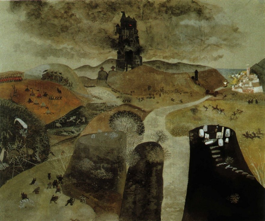
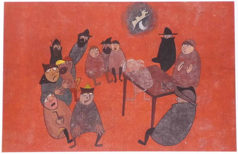
As I’ve said elsewhere, Cor Blok’s tolkien-inspired art is a radical departure for all sides, the ‘fine arts’ community and those who love J.R.R. Tolkien’s works. It’s challenging, all right; it asks us to do some work, not just sit back and enjoy, and for some people it will simply be too alien to engage with. Not everyone will be able to look at this calendar with curiosity. But Cor Blok’s work has the capacity to engage attention, get response and start thought; it isn’t brazenly offputting in the way that too much modern art is, too bent on ‘shocking the bourgeois’ to stop and think what that means, let alone what else art can do. These may be old paintings from the 1960’s, but they bring something new and different to the series of Tolkien Calendars, which have so far always been classically representational, and often in highly realistic styles. Thinking about that, if we can do it – and I hope many of us will, though I know some won’t – has to be a good thing.
***
To hold a contemplative gaze, artwork has to have more to it than art that really does say everything in a single glance. That’s nothing to do with abstraction versus figuration, with size, or with reduced means versus rich ones. If we look at literature, a short and seemingly simple poem can be a thing to live with for a lifetime, slowly unfolding more and more meaning. The same thing happens with paintings. Speaking personally, I could spend days in front of the fairly small Mondrian in the Stedelijk Gallery in Amsterdam, which does as much with little as a Japanese Zen meditation garden. Contrariwise, I’ve seen big paintings with lots going on in them that just don’t hold me, and it doesn’t seem to matter if it’s a Victorian narrative piece or a Jackson Pollock. What it is that sustains long looking is a quality I’m not sure I have an adequate word for; complexity of content is about as close as I can come (perhaps as a former Professor in this area, Cor Blok himself might be able to suggest something better). It’s a lot easier to give examples that you can readily share.
It’s hard enough to pull off this trick of creating a painting that will take the ‘long look’ when it is a thing unto itself. Adding in a story behind the image creates an extra layer, and one which I would say makes life harder, not easier, for the artist, though common sense might suggest otherwise. A little consideration of literary parallels will soon show what I mean, though. Retellings of legends are mostly not as good as their sources; few modern Arthurian novels are really good books, for instance. From the anonymous writer of Sir Gawain and the Green Knight to J. R. R. Tolkien himself, it is the making of a new creation from a mix of external source and personal inspiration that brings success. For the visual artist inspired by a verbal text, that’s a tall order, and one which I would say is little understood nowadays. Claude Lorraine could paint landscapes incorporating Biblical or mythological stories with confidence in their nature as new versions, visual retellings in different dress. We don’t seem to know how any more; perhaps the Romantic ideal of the artist as original genius has made it too hard for us to see re–creation as ‘real art’. Cor Blok’s Tolkien Calendar itself is as close to a ‘text’ on the matter from a Modernist viewpoint as I’ve ever seen. It may or may not succeed on its own terms, but it’s a valuable lesson in one way in which it might be done.
An attentive reader will notice that I’ve obviously been ‘cheating’ in my appreciation of this year’s calendar, looking at images out of time; and so I have. Attempting to understand what I do and don’t like, and why, has meant spending a lot of time looking at it in a rather different way, one that introduces a whole new level of complexness, and some interesting new ideas. An easelpainting is a single image, one which, no matter what its scale or how much you cram in there, can only say so much. Eventually, indeed, trying to add more is counterproductive. Overdo it, and the work becomes an unintelligible mess, neither aesthetically nor intellectually satisfying. Sometimes knowing when to stop is the real mark of the artist. You couldn’t very well fit the whole of The Lord of the Rings into a single painting (or a one-hour film), and tackling large-scale events within the story takes real care. It is possible to paint the Battle of the Pelennor Fields, rather than a single incident within it, but the artist had better know their precedents, such as European battlepieces (Albrecht Altdorfer’s Battle of Issus springs to mind) or the narrative handscrolls and standing screens of the East, before they tackle such a demanding subject. I’m speaking from experience here, since I found all that out when painting The Battle of the Five Armies, something possible only with simultaneous narrative and in bird’s-eye nonperspective. The result may look unsophisticated to eyes unused to nonphotographic art, but – as with Frodo’s Vision – every touch in that painting has a reason for being there.
This is where this year’s calendar introduces another possibility. The pictures by Cor Blok which it reproduces are part of a larger group, a sequence of images inspired by The Lord of the Rings. Series painting is one clear way out of the constraints of the single image, and it has some important precedents. The English painter J.M.W. Turner sometimes used groups of watercolours to introduce linked ideas, expanding the scope of what he wanted to say while keeping each painting as a thing to itself. The French Impressionist painter Claude Monet’s serial paintings are much better known. Their intellectual underpinnings are however often downplayed in favour of the idea that this is all somehow mere ‘coloured photography before the fact’, a ‘simple’ record of things seen. In actual fact it’s very clear that Monet knew exactly what he was doing and what overtones he wanted these series to carry. One good example of this is the way in which to this day, English-language books often talk about Monet’s Haystacks. That title is more than just a stupid translation mistake, it entirely disguises the point of what these paintings are ‘about’. Monet was painting Grainstacks – stores of wheat, the ultimate yield of the farmer’s labours, the assurance of the bread whose lack famously sparked Revolution, the wealth of France Profondé with all its connotations of the heart of the nation, rooted in the past yet offering hope for the future. Writing about these pictures, Monet said that he was trying to paint all he experienced when sitting painting before those stacks. The French verb which he used, éprouver, covers a totality of knowledge savoured over time, not just immediate physical experience but all the intellectual and emotional associations conjured up by the subject. That’s a lot to pack into a landscape, or even a series of them, but it certainly shows how serious Monet was, behind the veil of ‘mere’ eye and landscape painter.
Series paintings have great possibilities, but one obvious problem. Claude Monet never found a good answer to what to do about the dispersal of series of paintings as they are sold. None of us will ever be able to experience the full power of the Grainstacks, not as they were first shown at Durand-Ruel’s gallery in Paris in 1891. The one series of Monet’s which has stayed together, the Waterlilies at the Orangerie in Paris, are totally immobile; you have to go there to appreciate the sheer scale of the project, and their uncanny ability to recapitulate a century of art history from Corot to Jackson Pollock as you walk towards them. J.M.W. Turner by contrast got round that one handily; most of his watercolours were actually intended to be engraved as prints, so that groups of paintings would stay together in a sense, even if the originals were scattered far and wide by sale. That tactic also allowed many people to enjoy his art, bolstering his finances and spreading his ideas. Indeed, we may be doing Turner a serious disservice by concentrating on his ‘original’ work out of our own belief in its high worth as unique object, when he saw the prints as being at least as important. The possibilities of the print series have been exploited in Europe, but the low profile of the art print in recent times means the idea will be far more familiar to most people from Japanese art. From the familiar landscapes of Hokusai or Hiroshige to less well known areas such as warrior prints, the series was one of the mainstays of Ukiyo-é art printing, and works such as these show what can be done with the idea. Prints are in my view the best fine art answer to the problem of dispersal of series. They keep sets of images together, organised in the sequence their creator intended; they allow widespread and accurate viewing; they allow a huge range of choice of techniques, ranging from reproductions of an easelpainting, though translations between media such as J. M. W. Turner used, to works such as those of Hiroshige where the print run itself is the original.
This is why I am absolutely delighted to hear that there will be a book about Cor Blok’s paintings inspired by J. R. R. Tolkien. It may be no substitute for seeing the originals, but it’s ever so much better than nothing. This way, we can begin to get some idea of the true scale and scope of what Cor Blok did, in what seems to have been a highly remarkable outburst of creativity. Hopefully, if Cor Blok himself feels that these paintings belong in a particular sequence of whatever sort, we will get to see it or at least to know about it so we can choose to look at the reproductions in that order. That would give us a magnificent chance to understand an important instance of artistic response to verbal narrative in the 20th century – as well as to contemplate at leisure some very remarkable art.
***
However...
My roots as a serious artist, rather than just a creative amateur, lie in a single flashpoint moment more than twenty years ago now, when I held a real mediaeval manuscript, a Book of Hours, in my hands, and had the chance not just to look, to take that single glance at one double-page, but to read – to seek understanding through slow and careful perusal. The text may have been beyond my comprehension but the visual complexity of the book unfolded itself to my increasing delight. That moment can’t help but influence me still – and in this debate above all. I do believe that the illustrated book is another answer to the question of how to create complex, long-glance art – just not perhaps the illustrated book as most of us know it today.
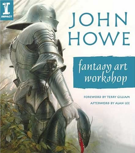
Again, it’s easiest to take examples that will hopefully be accessible, and maybe even familiar. There haven’t been a lot of fully illustrated editions of JRR Tolkien’s work, but there is an important difference between the earliest ones, Pauline Baynes’ editions of Farmer Giles of Ham and Smith of Wooton Major, and the more recent like of Alan Lee’s Lord of the Rings, Michael Hague’s Hobbit, and even Ted Nasmith’s Silmarillion. Hague, Lee and Nasmith’s books may be pretty, but coming right down to basics, they’re really only editions of the text with prints of easelpaintings inspired by it bound in. There is no sign that the book was designed as a whole, or that the paintings form any sort of coherent, intentional sequence. The Alan Lee Hobbit was markedly more thought-through than the other recent illustrated editions of Tolkien’s work, but its very adult approach – however appealing to the fan market – would I suspect have misfired badly with the major market for any childrens’ ‘classic’, adults buying books for children. Pauline Baynes’ work by contrast exploits the fact that it’s black-and-white art which by the technology of the time could be printed in with the letterpress, to make itself an integral part of the book, designed as a whole in which text and illustrations work together. None of the more recent books with their colour artwork, fine as some of it is, show any sign of being designed to get around the limitations of technology and ideology (it is known that there were limits set on what could be shown in the Silmarillion, for instance) in order to present a balanced, satisfying whole of a book.
There are not a lot of recent examples of books that really take advantage of the visual alongside their verbal text to create a work of art in itself, uniting word and image. You have to look at good recent fine-press work – in English, the best work of the Folio Society, for example – or at older books from the turn of the previous century, such as the best of the many editions of Lewis Carrol’s Alice in Wonderland or, on a more serious plane, the edition of Malory’s Le Mort Darthur produced by J.M. Dent. These (and many more like them) are editions of classic books which publisher and public alike have wanted in well-made, well-designed, well-embellished forms. Could that be done nowadays without bankrupting the publisher, the usual excuse? Certainly. Print technology is at such a high pitch nowadays that really, if you can imagine it, it can be done. You only have to look at nonfiction works and children’s illustrated books to understand how intricate an interlace of word and image can be achieved and still have an economically viable product. If anyone wants to know how it could be done, the Dent Mort Darthur is a good example of how to produce a great illustrated book at a reasonable price, taking every possible advantage of current technology and careful basic design work before the artist was ever involved; it looks far more expensive and intricate than it actually was.
We’re prone nowadays in constructing an illustrated book for adults just to put in full-page pictures, which sit by themselves on a page. That’s easy – but I’d also call it lazy. It’s a reflection of the same ideas that neatly clip mediaeval miniatures out of their surrounds and present them as false panel-paintings in books of reproductions. You can do a lot more, if you want to; you can create whole pages where word, image and seeming decoration all work together to carry both aesthetics and information. We don’t have good terms for artwork that isn’t on either extreme, photographically realistic or totally abstract, yet it’s in that spectrum of possibilities that we find work like Pauline Baynes’, or Cor Blok’s. That sort of visual imagery can work alongside a text without usurping a reader’s own imaginative response. Art like this can work on many levels simultaneously: as eyepleasing, reader-attracting decoration; as a show of respect to the text and its author; as provider of information; whichever level we choose to take it at. It doesn’t determine what something looks like, it only suggests it, and as long as it’s interpretable it can be expanded by the individual viewer – visual applicability, to borrow one of J. R. R. Tolkien’s key concepts. Undoubtedly, the unembellished text will always hold a place, and many people won’t want the book any other way. Yet if a book has the ‘classic’ status that we would all argue J. R. R. Tolkien’s work should hold, then part of that undoubtedly is the existence of fine-press editions making full use of art and printing. If the Tolkien Estate and HarperCollins could take that idea on board, then maybe one day I’ll get to hold an edition of one of J. R. R. Tolkien’s books which is as beautiful, as fitting and as visually absorbing as that long-ago Book of Hours in the Special Collections of the library at the University of Aberdeen.
***
To sum up what I’ve tried to say here, there’s a vast difference in both theory and practice between the Modernist museum-based ideology of the image working at a single glance, which Cor Blok speaks of, and the domestic situation of the picture at home, on a wall, in a calendar or in a book, which can be contemplated at leisure and yield meaning on many occasions. There’s been much theorising about the former situation and little on the latter, yet that’s the most common way for us to experience images. Art which can satisfy the contemplative gaze tends towards complexity of content, like a good poem, even when its means are seemingly simple. The single image has very real limits, but there are formats which transcend them. The series of paintings is an obvious one; it too has problems and limits, but many of those are – or can be – answered by the series of prints and its popular equivalent, the art calendar. And there is still, beyond all, the illustrated and illuminated book, the only artform in which image and text can work together. As a trained illustrator with knowledge of both medieval manuscripts and recent fine-printing, I do still believe that there’s a place for the illustrated edition in the world of art inspired by Tolkien. The question of the validity of illustration itself is another story for another day, but surely the idea of Tolkien as a ‘classic’, fit to stand alongside Malory, Coleridge or Dante and to have his writings produced to the same level of quality, is one that all of us reading this can agree on and appreciate.
This isn’t an academic essay, so I haven’t footnoted my points.
In case anyone wants to take them further, however, here’s a short list of suggested reading to get you started:
Michael Ann Holly and Keith Moxey (editors), 2002; ‘Art History, Aesthetics, Visual Studies’; Yale University Press, New Haven and London, and Sterling and Francine Clark Art Institute.
Barbara Tepa Lupack and Alan Lupack, 2008; ‘Illustrating Camelot’, D. S. Brewer.
Susie Nash, 2008; ‘Northern Renaissance Art’, Oxford University Press.
Paul Hayes Tucker, 1989; ‘Monet in the ‘90’s; the Series Paintings’; Yale University Press, New Haven and London, and Museum of Fine Arts, Boston.
Iain Warrell (editor) 2007; ‘J. M. W. Turner’; Tate Publishing.
Have fun!
Ruth Lacon
More on the illustrations by Ruth Lacon
Ruth Lacon is a skilled illustrator and calligrapher, highly influenced by early Persian manuscripts. Her work can be seen in The Ruins of Osgiliath, the Nigglins, Amon Hen, Mallorn and in books like for example "The Uncharted Realms of Tolkien". The Tale of Gondolin would not have existed as we know it know if Ruth Lancon from Edinburgh had not been inspired by The Fall of Gondolin Song Cycle. In 1993 Ruth Lancon send 17 fine illustrations to Alex Lewis together with the suggestion of publishing The Tale of Gondolin for members of the Tolkien Society. All the rest is history now...
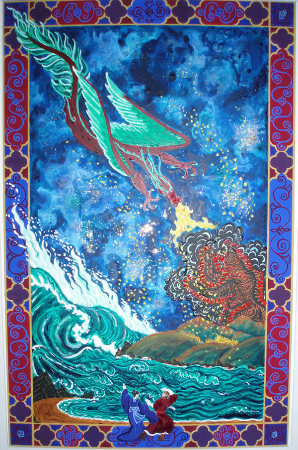
WhitedragonRL is an illustration to Roverandom, whose proper title is Escape! the Two rovers Flee the Great White Dragon.
Ruth Lacon picked this one to put here, as it shows pretty clearly how one can imply space but deny it at the same time in such a decorative style.
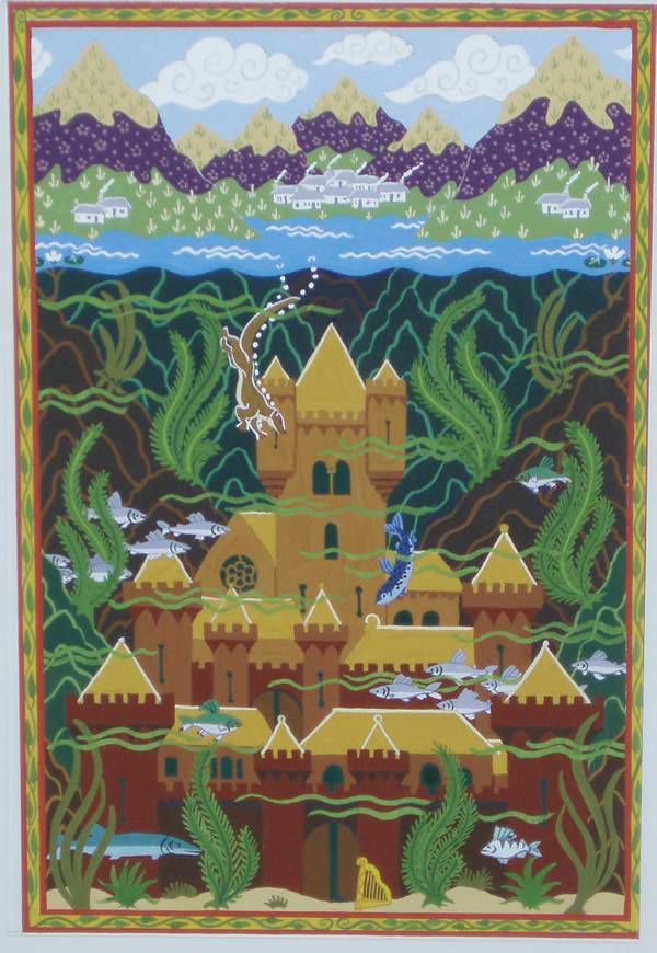
Its proper title is simply The Sunken Palace, and it draws on the Welsh legend of the couple who gain riches and place by foul means, only for their grand manor-house to be overcome by an unexpected vengeance in the shape of a flood at a grand feast, whose only survivor is the harper.
Tolkien Calendar 2011
The Tolkien Calendar has become an established publishing event, eagerly looked forward to by Tolkien fans the world over; there is much demand for the annual calendar, with Tolkien calendars from the past 30 years becoming collectors’ items.
This year’s continues in that tradition and is the perfect Christmas gift for lovers of fine fantasy art.
Tolkien Calendar 2012
Publisher: Harper Paperbacks
Publication Date: 16 Aug 2011
Type: Calendar, 32 pages
ISBN-10: 006208920X
ISBN-13: 978-0062089205
Spread the news about this J.R.R. Tolkien article:
